Thursday, June 30, 2011

30 St. Mary Axe

I personally don't like how people call this building "Gherkin" or "The Cucumber", but who am I to criticize others... "Swiss Re" and "30 St. Mary Axe" sound prettier and we all know the building deserves a nice name, no?


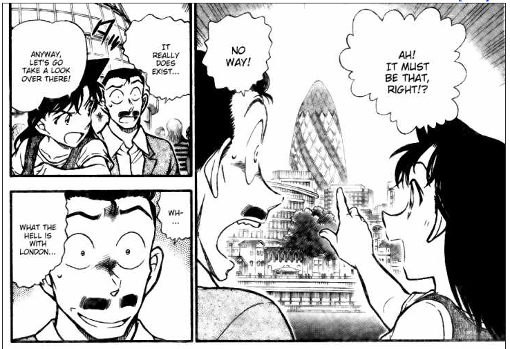
Who read Detective Conan and remember the fab London arc?

One of my non-architectural friend actually recognized this building from reading the manga, so yeah it's cool XD

Aoyama Gosho also featured Foster's City Hall in the riddles - I'll post it tomorrow - and he covered many spots in London, including The Sherlock Holmes Museum (where the hell was I when I visited London? 30 lousy minutes by the Westminster bridge to avoid the bus leaving me there!) OAO

Anyway.

Enjoy this fab work :)


Swiss Re HQ, 30 St. Mary Axe | London
Foster + Partners


From Foster + Partners :


London's first ecological tall building and an instantly recognisable addition to the citys skyline, 30 St Mary Axe is rooted in a radical approach - technically, architecturally, socially and spatially. Commissioned by Swiss Re, one of the worlds leading reinsurance companies, it rises forty-one storeys and provides 76,400 square metres of accommodation, including offices and a shopping arcade accessed from a newly created public plaza. At the very top of the building Londons highest occupied floor - is a club room that offers a spectacular 360-degree panorama across the capital.

Generated by a radial plan, with a circular perimeter, the building widens in profile as it rises and tapers towards its apex. This distinctive form responds to the constraints of the site: the building appears more slender than a rectangular block of equivalent size; reflections are reduced and transparency is improved; and the slimming of its profile towards the base maximises the public realm at ground level. Environmentally, its profile reduces the amount of wind deflected to the ground compared with a rectilinear tower of similar size, helping to maintain pedestrian comfort at street level, and creates external pressure differentials that are exploited to drive a unique system of natural ventilation.


Conceptually the tower develops ideas explored in the Commerzbank and before that in the Climatroffice, a theoretical project with Buckminster Fuller that suggested a new rapport between nature and the workplace, its energy-conscious enclosure resolving walls and roof into a continuous triangulated skin. Here, the towers diagonally braced structural envelope allows column-free floor space and a fully glazed facade, which opens up the building to light and views. Atria between the radiating fingers of each floor link together vertically to form a series of informal break-out spaces that spiral up the building. These spaces are a natural social focus places for refreshment points and meeting areas - and function as the buildings lungs, distributing fresh air drawn in through opening panels in the faade. This system reduces the towers reliance on air conditioning and together with other sustainable measures, means that the building is expected to use up to half the energy consumed by air-conditioned office towers.


In 2004, 30 St Mary Axe won the RIBA Stirling Prize. Accepting the award from George Ferguson, the President of the Royal Institute of British Architects, Norman Foster thanked the jury for acknowledging the significance of its design. Winning the Stirling Prize is a great honour, he stated, It is a credit to the commitment and vision of an exceptional client and a talented team. 30 St Mary Axe is an embodiment of the core values that we have championed for more than thirty years: values about humanising the workplace, conserving energy, democratising the way people communicate within a building, and the way that building relates to the urban realm.

Wednesday, June 29, 2011

Tuesday, June 28, 2011

Monday, June 27, 2011

Homemade nature

Like I said before... Japanese themes never cease to tire me :)


Kamakura House | Kamakura
Foster + Partners


Designed for a prominent collector of Buddhist art, this house was conceived as a modern retreat with distinctly Japanese influences. Located in a quiet residential neighbourhood of Kamakura, a coastal town one hour south of Tokyo, the house occupies a site with rich historical associations. These include a Shinto shrine and caves, carved by hand into the cliff-face, which formed part of an eleventh-century workshop for crafting samurai swords. The house is one of three buildings on the site alongside a pavilion, with a gallery for displaying art works, a large function space, and specialised storage. The overall composition ties these buildings together in a harmonious arrangement, informed by the Japanese belief that nature is at its most beautiful when considered in relation to the man-made.

A series of parallel structural walls organises the interior spaces of all three buildings, which are further articulated by perpendicular infill walls that carry the service functions. Special attention has been paid to the subtle use of colour throughout the interiors, with muted tones and dark grey ceilings that add a degree of intimacy. The design team developed a number of specialised materials for the project. The primary walls are clad with a custom-manufactured reconstructed stone, while glass blocks made from recycled television tubes provide diffuse light. Hand-sculpted terrazzo elements are used throughout. The floor surfaces are covered in part with antique Chinese tiles, and the indoor pool is finished in glazed volcanic stone tiles.

The house is planned around the rugged landscape and focuses on a mature cherry tree. Circulation through the building is organised around a sequence of views that progressively move from darkened to fully lit rooms, revealing the houses natural surroundings and the clients extensive antique and modern art collection. A comprehensive integrated lighting system, which includes fibre-optic installations, dedicated spotlights, and naturally backlit glass blocks, further emphasises major individual art works. The attention to the play of light and shadow, created through a combination of materials and artificial and natural light, is fundamental to the design of the house and evokes the quietude of traditional Japanese architecture.

Sunday, June 26, 2011

Curiosity kills the cat ...no more!

Well, they say "curiosity kills the cat".

But this Japanese architect actually found a way to prevent it:
just provide the place for cats to be curious!

Neko no Ie (The Cat House) | Tokyo
Key Operation


The steps on the wall are so cute~
I wonder what it's like to be a cat and live in this house.

From dezeen:

A century ago, the famous Japanese novelist Sosuke Natsume wrote a novel called “I Am a Cat (Wagahai Wa Neko De Aru).” It is written from the point of view of a cat.

The cat, who remains nameless during the novel’s first chapter, lives in a house with a teacher and his family. He is angry that he is not regarded as an equal member of the family in this household. “I will never catch mice,” the cat announces haughtily, not wishing to make himself useful.

What if, however, there was a house, which has been designed specifically with a cat in mind? What would it look like? The Japanese architect Akira Koyama of Key Operation Inc. has recently designed a house for a young family, which included a pet cat, in the densely populated Taishido district, west of Tokyo. Undoubtedly, this house would have made Natsume’s cat green with envy.

Neko no Ie (The Cat House) stands on a typically compact, rectilinear site (7 meters wide, 12 meters deep) along a narrow residential street, just big enough for a single car to pass through.

Although the plot is small, the client (including the cat) did not specify the need for an outdoor garden space, and so the architect decided to set the house back by 3 meters from the street, thereby creating a void, synonymous in Japan with a sense of luxury.

The upper section of the house is further set back from the ground level, generating a balcony. It is generally perceived that the Japanese architects have a greater freedom of expression than the Western counterparts but we forget that there are a number of restrictions that the Japanese architects face when designing buildings in Japan, and this is no exception.

There is a law, for example, restricting the owning of a car to those who can ensure its parking space. Neko no Ie, like many houses on the street, accommodates a garage within the house.

The architect faced yet another restriction imposed in this area. It forbade the use of bright colours on exterior facades so that the ‘scenery’ of the area is conserved. Neko no Ie’s grey stucco façade complies with this regulation.

Undeterred, however, Koyama subtly managed to subvert both of these restrictions by painting the inside of the garage bright pink, therefore making a feature out of what is usually a dark and dingy space and injecting much-needed playfulness in this otherwise boring grey neighbourhood.

The house’s asymmetrical roofline maximizes both its playfulness as well as its volume. The architect has created within a complex interior space consisting of rooms of varying sizes, which are stack on top of each other over three floors.

One would not be able to observe such a structure from outside of the house, but it reflects the layout of the area, which has a mixture of detached houses, both large and small.

The biggest room in the house is the dining/living room, stretched horizontally to fit the whole width of the house. By extending the room vertically, the architect has opened up this room to the rest of the house.

What look like shelves jutting out of one wall of this room are actually steppingstones for the pet cat to enter into the adjacent rooms through the openings placed higher up on the wall.

This arrangement leaves the ample staircase and landings, which double up as a library, undisturbed from the burst of activities of the feline member of the family, while the rest of the family uses them as a place of quietude.

oreover, just as the garage became the visual focal point for the exterior of the house, the staircase, painted also brightly pink, signals a gathering of all the separate interior sections of Neko no Ie.

By varying the sizes of the rooms and painting them in different colours, the architect has emphasized their uniqueness and separateness.

At the same time, he has managed to link the rooms through small and large openings so that none of the rooms is completely isolated. Autonomy is respected but isolation is discouraged.

For instance, a large opening in the wall of the dining/living room, which looks into the kitchen, allows the person who is cooking to connect with the person who is being served.

In the meantime, the cat can slip into the study located above the kitchen through yet another, this time smaller, opening.

The rooms’ co-dependence is thus implicitly emphasized.

Neko no Ie is a symbolic celebration of the emergence of the modern Japanese family, more democratic than the traditional one preceding it, allowing each member to flourish independently while nurturing a supportive environment.

Ironically, a pet cat was an integral part of it.

Text by Yuki Sumner, 2011

Saturday, June 25, 2011

Now that's glassy

Another one of my facade case studies in studio 4.
First saw this in my lecturer's iPad.

The glass panels was arranged to form some kind of wave and created this massy-but-voidy kind of feel...
(do those words even exist?!)

Anyway. Be grateful, people who live far from the ring of fire!!!

I can't imagine installing this kind of facade in Jakarta.
One earthquake and tiny little cracks...

Let's just say glass rain wouldn't feel as pretty or glittery as it looks.

Mint Toy Museum | Singapore
SCDA Architects


Friday, June 24, 2011

A design #3

The 3rd post of my "a design by a designer for a designer" collection XD
Still loving this line. Gonna post a lot more of 'em in the future!

This time, well, to redeem the Koolhaas fever in the last few days...
I gotta have something from OMA at least.


Fondazione Prada | Venice, Italy 2011
OMA*AMO for/with Prada


Check out the previous "A design" series in:

"A design"
Featuring Roberto Cavalli by Studio Italia Rota

 "A design #2"
Featuring Chanel by Zaha Hadid
Commissioned by Karl Lagerfeld  

Thursday, June 23, 2011

Sticks and... sticks?

Prostho Museum Research Centre
Kengo Kuma and Associates

Wednesday, June 22, 2011

Aye, me hearties!!

"Yo, ho, haul together
Hoist the colors high
Heave ho, thieves and beggars,
Never shall we die."

- Pirates of The Caribbean: At World's End OST by Hans Zimmer -

+ + +

Remember those big X marks in the classic pirate maps we used to have as kids?


Apparently I'm not the only one obsessed with Johnny Depp.
Or Jack Sparrow.
NYC can't get enough of PoTC too~!


+ Pool | New York City
Family and Playlab in collaboration with Arup


From Archdaily:

EVERYTHING IS BETTER WITH A POOL
+ Pool is the collaborative initiative of design studios Family and PlayLab to build a floating pool for everyone in the rivers of New York City. The project was launched with the ambition to improve the use of the city’s natural resources by providing a clean and safe way for the public to swim in New York’s waters.
As both a public amenity and an ecological prototype, + Pool is a small but exciting precedent for environmental urbanism in the 21st Century.


NYC + POOL
+ Pool is for you, for your friend, for your mom, for your dad, for your girlfriend, for your kids, for your boss, for your bartender, for your tamale guy, for your other girlfriend, for New York City, for everyone.
An offshore reflection of the city intersection, + Pool both exemplifies the dense, busy character of New York City and offers an island retreat from it.


EVERYONE + POOL
+ Pool should be enjoyed by everyone, at all times, which is why it’s designed as four pools in one: Children’s Pool, Sports Pool, Lap Pool and Lounge Pool. Each pool can be used independently to cater to all types of swimmers, combined to form an Olympic-length lap pool, or opened completely into a 9,000 square foot pool for play.


WATER + POOL
The most important aspect of + Pool’s design is that it filters river water through the pool’s walls – like a giant strainer dropped into the river.
The concentric layers of filtration materials that make up the sides of the pool are designed to remove bacteria, contaminants and odors, leaving only safe and swimmable water that meets city, state and federal standards of quality.


PARK + POOL
Its universally recognizable shape and unusual offshore siting immediately position + Pool as a iconic piece of public infrastructure.
Whether as a compliment to a thriving park or catalyst for a growing one, the pool can serve as a destination for weekend visitors, an island haven for busy locals, and a symbol for the surrounding neighborhood.


TEAM + POOL
After the launch of + Pool in the summer of 2010, Family and PlayLab began meeting with waterfront organizations, engineers, urban planners, environmental experts, public and private developers and community organizations to build a team to push the project forward. Likeminded institutions like The Metropolitan Waterfront Association, NYC Swim and the Department of Parks and Recreation have all been integral in shaping both the design and process of the pool itself.
+ Pool team has been working with renowned engineering firm Arup New York to study the filtration, structural, mechanical and energy systems of the pool as well as the water quality conditions and regulations necessary for the project. The team recently completed a preliminary engineering feasibility report in preparation for the material and methods testing phase.

...okay so it's a (+) not an (x). Cookie? :D

Tuesday, June 21, 2011

Aurora

Aurora Pavilion
Shanghai Expo 2010


Oh, I met Rem Koolhaas today.

(Yes, THAT Rem Koolhas.)

He's currently visiting Jakarta so he kinda stopped by to our university's architecture department.
Both thrilled and speechless. Took a lot of pics to make myself sure I wasn't dreaming (lol).
Too bad I ran out tickets for his seminar :'(

Btw, he's TALL!!!!
I passed him first when he came from the parking area. Literally had to look up.

Anyway, hooray :p

Monday, June 20, 2011

I. Want. This. Bar. In. My. House.

Brownstone Bar | Shanghai
Kokaistudios


I love seeing how Asian architecture going even cooler from time to time :)

Sunday, June 19, 2011

Write on glass

I see glass walls with writings, I see the movie "13 ghosts".
God, the horror of photographic memories...


Shanghai Museum of Glass
Logon Architecture


From Archdaily:


Located in Shanghai’s Baoshan District, this former glass manufacturing site covers a total area of 29,612sqm including thirty existing buildings varying in age and scale. logon developed the entire 20 year strategic development plan renaming the site to G+Glass Theme Park (Glass, Art, Research and Technology Park). Phase one includes the Shanghai Museum of Glass and a hot glass show covering a total site area of 5,785sqm


The Shanghai Museum of Glass multifunctional design combines exhibitions with hot glass shows, DIY workshops, lectures, libraries, restaurants, coffees, events, shops, public space and so on. Its’ sustainable adaptive reuse design and modern feel incorporate old and new ideas making it the first of its’ kind in China. The Entrance Plaza is the face of the museum enabling immediate recognition and recall for visitors where it guides people into the museum, hot glass show and surrounding areas.


The new entrance building stands on the Entrance Plaza acting as a welcoming platform for the museum. Contrasting the dark facade with the bright lobby interior creates a unique first impression for visitors to the museum. The facade is made from U shaped glass imported from Germany, sand blasted and enameled to reveal transparent glass-related words in various languages. Behind the glass facade is a LED backlight that allows light to glow through each word on its black background; the final effect is breathtaking by night. The Shanghai Museum of Glass will educate and entertain thousands of visitors whilst adding value to the local district government and people for years to come.

Saturday, June 18, 2011

The making of a swing

Finished my mid-term exam!
To celebrate the end of the short hiatus, let's start with something light~

Sunday, June 12, 2011

Noodle, people?

Beijing Noodle No. 9 | Las Vegas
design spirits co., ltd

PS:
  Dear Architortureland residents,
       my mid-term exam is due June 13
            so I'd probably be away
                 for a week or so
                     ...for the sake of my sanity.
                           Wish me luck! \(- -)/*******

Saturday, June 11, 2011

Friday, June 10, 2011

Tori! Tori! Tori!

Tori Tori Restaurant | Mexico City
Rojkind Arquitectos and Hector Esrawe


Thursday, June 9, 2011

Wednesday, June 8, 2011

Somebody call 911!

Ever seen a burning building in which people keep walking?
No?


Thus, I declare the saying "no smoke without fire" is not always true.


Blur Building | Swiss
Diller Scofidio + Renfro

From the architect:
The Blur Building was built for the Swiss Expo 2002 on Lake Neuchatel. It is an architecture of atmosphere. The lightweight tensegrity structure measures 300 feet wide by 200 feet deep by 75 feet high. The primary building material is indigenous to the site, water. Water is pumped from the lake, filtered, and shot as a fine mist through 31,500 high-pressure mist nozzles. A smart weather system reads the shifting climactic conditions of temperature, humidity, wind speed and direction, and processes the data in a central computer that regulates water pressure.
Upon entering the fog mass, visual and acoustic references are erased, leaving only an optical "white-out" and the "white-noise" of pulsing nozzles. Blur is an anti-spectacle. Contrary to immersive environments that strive for high-definition visual fidelity with ever-greater technical virtuosity, Blur is decidedly low-definition: there is nothing to see but our dependence on vision itself.

Tuesday, June 7, 2011

The white tree of...

...GONDOR !!

As a huge fan of Tolkien's "The Lord of The Rings",
I'd be lying to say this didn't remind me of The White Tree of Gondor.

Bite me.

The Tote | Mumbai
Serie Architects


Monday, June 6, 2011

Desperate vs delusional

From Architizer.

"We identified a few of the most common visual gambits in the architectural photography game, from the desperate to the delusional."


Sunday, June 5, 2011

On "how do they do it"

"We design by challenging - by asking the right questions."
- Foster and Partners 

Saturday, June 4, 2011

When Kaohsiung glows

2nd place in Kaohsiung Marine Gate Project
Asymptote Architecture and Artech Architects 


From Archdaily:

Asymptote Architecture and Artech Architects were awarded a close second place finish for the Kaohsiung Marine Gateway project.
The project proposes a 200m long structure situated between two 14 story towers located at the cities newly developed harbor edge. The proposal calls for a new urban intervention at the cities waterfront combining both cultural and commercial aspects with the port terminal functions the building is designed to house. The buildings technological envelope and architecture and is designed to be a striking and elegant addition to the quickly changing city of Kaohsiung and to act as a catalyst for unique and sustained urban development over the coming years and decades.
Asymptote’s design for the new Kaohsiung Marine Gateway Terminal proposes a visually powerful and highly efficient transport and public facility that connects the heart of Kaohsiung to the city’s impressive waterfront.
The Kaohsiung Marine Gateway Terminal as envisioned by Asymptote is designed to invigorate and activate Kaohsiung’s city edge at the waterfront though vibrant open public spaces and facilities that together bring a powerful and electric experience to the city 24 hours a day. The new Kaohsiung Marine Gateway Terminal would become the primary marine gateway to both the city of Kaohsiung as well as to all of Taiwan.
The new Kaohsiung Marine Gateway Terminal is designed as a new state of the art transport interchange, a destination with both public and private commercial facilities including exhibition and event spaces for the people of Kaohsiung as well as for national and international visitors.
The project transforms the site from its industrial roots into a dynamic urban hub, the new terminal is a celebration of international travel as well as local culture and recreation.